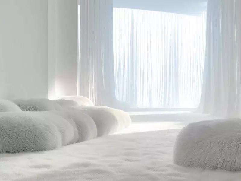
The global authority on colour, Pantone, has announced its influential Colour of the Year for 2026: a shade named Cloud Dancer. Revealed on January 16, 2026, this selection marks a significant shift towards tranquility and simplicity in design.
A Blank Canvas for a New Beginning
Cloud Dancer is described as a quiet, clean, and crisp white. Unlike a stark, clinical white, it is intended to evoke a sense of calm and open space. According to Laurie Pressman, Vice-President of the Pantone Color Institute, the choice is deeply symbolic.
"Like a blank canvas, Cloud Dancer signifies our collective desire for a fresh start," Pressman explains. She suggests the colour represents a moment to pause and reset, encouraging people to peel away outdated thinking and welcome new approaches. This is a notable direction at the start of a new year, following periods of maximalist and high-impact design trends.

The Designer's Perspective on Using White
For professional interior designers, white is never merely a colour choice; it's a strategic foundation. Jocelyn Ross, an interior designer with JRstudioworks, views white as the perfect backdrop for creating layered, art-focused interiors.
"I always start with white because it offers the perfect backdrop for layered interiors and the art on the walls," Ross states. She personally prefers warmer whites but acknowledges the appeal of Cloud Dancer's cleaner, cooler tone in specific settings.
Ross notes that committing to an all-white palette can be a surprisingly bold move for homeowners. "I often have to convince clients to go all white because their initial reaction is that it will feel cold or sterile," she says. However, that fear usually dissipates when the space is completed with thoughtful texture and layering.
How to Integrate Cloud Dancer in Your Home
According to design experts, Cloud Dancer excels as a foundational colour. It is best applied to walls, millwork, and architectural elements where it can act as a clean, neutral stage for other design features to shine.
Because Cloud Dancer leans towards the cooler spectrum, Ross advises introducing warmth to balance it. "If I were starting with Cloud Dancer, I would soften it with woods and textiles," she recommends. Incorporating natural materials like wood and stone, along with strategic lighting and rich textiles, can prevent the space from feeling flat or austere.
A crucial piece of advice for Canadians considering this palette is to account for light. "Whites change dramatically depending on light, and with cooler whites, the margin for error is even smaller," Ross cautions. "If it starts to feel flat or cold, it probably is." Testing samples in the actual space at different times of day is essential.
The selection of Cloud Dancer reflects a broader design movement towards clarity, restraint, and intentional calm. It moves away from loud statements and instead offers a versatile, peaceful foundation for personal expression in homes across Canada and beyond.