
Spring Home Color Trends: Nature-Inspired Hues Transform Interiors
As the spring season unfolds, a vibrant shift is occurring in home interiors across Canada. Homeowners are increasingly moving away from the cold greys and stark whites that have dominated recent years, embracing instead a palette inspired by the natural world. This growing color curiosity represents a significant personalization of living spaces, with individuals seeking to create environments that reflect their unique tastes and lifestyles.
The Rise of Nature-Inspired Color Palettes
Leading paint manufacturers have identified this trend toward organic, earthy tones in their annual color selections. Benjamin Moore has designated Silhouette, a rich espresso hue, as its Color of the Year for 2026. Meanwhile, Sico and Dulux Paints have both chosen deep, forest-inspired greens—Boreal Forest and Pine Forest respectively—as their standout shades. Pantone, widely recognized as the global authority on color trends, has selected Cloud Dancer, a creamy off-white, as the essential shade for the coming year.
Alex Scott, manager of show home activations at Trico Homes in Calgary, observes this transformation firsthand. "Calgarians have traditionally been somewhat reserved with color choices, but we're witnessing a definite change in attitude," she notes. "There's a conscious movement toward warmer, more inviting interiors that connect with the natural environment."

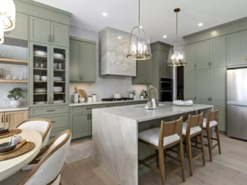
Practical Applications of Transformative Colors
Scott recommends incorporating nature-inspired shades of green and blue alongside warm, earthy neutrals to capture the essence of spring. She suggests envisioning sun-dazzled blue skies, sage green leaves, and complementary tones of charcoal and creamy beiges. "Color profoundly impacts the mood and atmosphere of any space," Scott emphasizes. "It's not merely decorative—it shapes how we experience our homes."
One of Scott's preferred shades is Benjamin Moore's Raintree Green, a sophisticated muted sage green with distinct grey undertones. In the recent Calgary STARS Lottery dream home project, she strategically applied this color throughout the kitchen—on the island base, cabinetry, and even the entire frame of the glass door leading to the butler's pantry. This layered approach demonstrates how a single hue can create cohesion while adding visual interest.
The Psychology and Practicality of Color Selection
Sharon Grech, color and design expert at Benjamin Moore, attributes this heightened color awareness to changing lifestyle patterns. "As people spend more hours at home for both work and leisure, there's increased recognition of how color influences our daily experiences," she explains. "We're seeing greater color curiosity overall, with homeowners seeking to create personalized, intentional spaces rather than simply following fleeting trends."
Design professionals understand that color serves as one of the most powerful tools for defining architectural details and establishing specific moods within a room. Typically, deeper, more saturated tones generate dramatic effects, while lighter shades evoke softer, more soothing feelings. However, lighting considerations remain paramount in the selection process.
"Lighting represents one of the most critical factors in color choice," Grech advises. "Colors transform dramatically throughout the day as natural light shifts, then change again under artificial lighting during evening hours. This variability underscores the importance of bringing paint samples into the actual space being painted before making final decisions."
Expert Recommendations for Successful Color Implementation
Grech offers specific guidance for homeowners navigating color selection:

- Choose large samples to accurately assess undertones that may be invisible in smaller chips
- Test paint directly on walls using sample pots once options have been narrowed
- Consider painting boards that can be moved around the room to compare with existing materials
- Apply color intentionally to highlight architectural features through accent walls, ceilings, or doors
"Strategic use of color brings personality and visual interest while allowing homeowners to control a room's ambiance," Grech concludes. "By thoughtfully mixing various tones through furnishings, painted surfaces, accessories, and artwork, wall color becomes a powerful tool for influencing both emotional response and aesthetic quality within any space."
This spring, as nature awakens with renewed vibrancy, Canadian homeowners are following suit—transforming their interiors with colors that reflect the beauty of the natural world while creating personalized sanctuaries that truly feel like home.