


Politics

Alberta ADAP Transition: Benefit Cuts Called Life-Altering
Albertans transitioning to ADAP report that cuts to benefits will be life-altering, affecting their daily lives and healthcare access.


Business
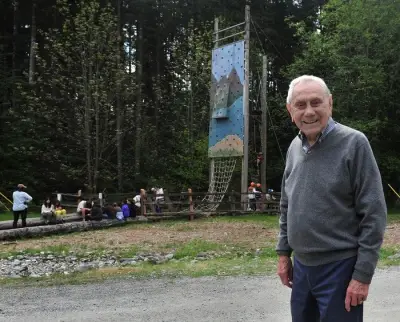
Mel Zajac, Vancouver Philanthropist Behind Children's Camp Charity, Dies at 98
Mel Zajac, founder of the Zajac Ranch for Children in Mission, which hosts 400 kids with medical disabilities each summer, died at 98.


Sports

Kitchener Rangers Fans Celebrate Memorial Cup Victory at Homecoming
Hundreds of fans gathered to welcome the Kitchener Rangers home after their Memorial Cup win. The team returned to a hero's welcome with celebrations.


Lifestyle

Teen Girl Accused of Stabbing Three Horses at Las Vegas Racing Event
A teenage girl was arrested for allegedly stabbing three horses at a Las Vegas racing event. The horses are safe, but the suspect faces multiple cruelty charges.


Health


Environment
Yellowhead Trail Closed Due to Heavy Rain Flooding
A section of Yellowhead Trail in Edmonton is closed after torrential rain caused flooding. Motorists are advised to use alternate routes as crews work to clear the water.
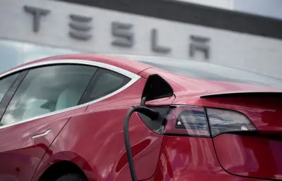
Tesla Sues Manitoba Government Over EV Rebate Exclusion
Tesla Motors Canada has filed a legal challenge against Manitoba's government after being excluded from the province's electric vehicle rebate program, citing substantial and unjustified harm.
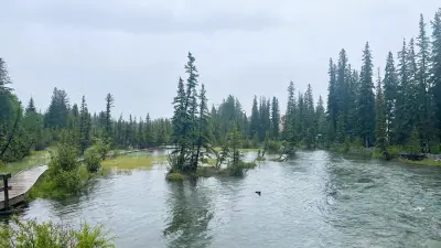
Canmore Flooding Less Severe Than 2013, Experts Say
Experts say flooding in Canmore is minor compared to 2013, as rainfall warnings continue in Calgary. Streets are affected but no major damage reported.
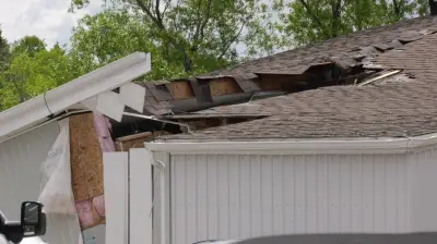
Erosion Threatens Grand Falls Grocery Store
A landslide in Grand Falls, N.B., has left a grocery store teetering on the edge of a steep embankment due to severe erosion, raising safety concerns.
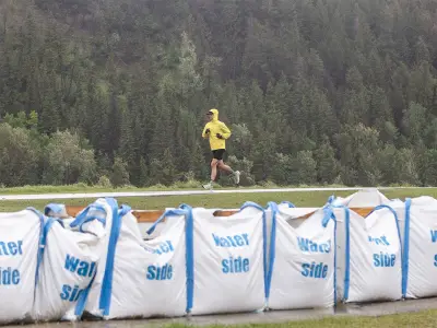
Calgary Officials Say Flooding Unlikely Despite Heavy Rain
City officials reassure Calgarians that extensive flooding is unlikely, with infrastructure and reservoir management reducing damage potential by over 70% compared to 2013.