Team Canada's World Baseball Classic Uniforms Spark Pre-Tournament Fashion Debate
Long before the first pitch was thrown in anger at the 2026 World Baseball Classic, a style-over-substance focus on team uniforms and hats dominated pre-tournament coverage across major sports media outlets.
Media Outlets Weigh In on International Baseball Fashion
Major publications including Sports Illustrated, Bleacher Report, Sporting News, USA Today, Newsweek, and The Athletic all offered their assessments of the diamond duds worn by the twenty national teams competing in the tournament. While Japan and Mexico received rave reviews for their uniforms, and Great Britain, Italy, Brazil, Czechia, and Israel found themselves ranked at the bottom by various outlets, Canada's attire became a particular point of contention.
Canada's uniforms were ranked 11th by Bleacher Report and Newsweek, 16th by USA Today, 14th by fansided.com, 10th by Sports Illustrated, 15th by Sporting News, and a surprisingly high fourth by The Athletic. It should be noted that while Mizuno produced Japan's jerseys, Nike was responsible for the uniforms of all other nations, including Canada's.

Specific Criticisms of Canada's Design Elements
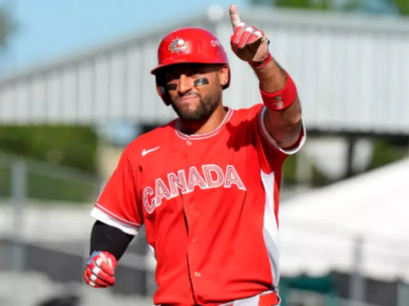
The critiques centered on two main elements: the jersey's word mark and the hat's logo. The word mark on the front of the jersey, which pays homage to the Toronto Blue Jays, received mixed reactions. Some appreciated the nod, while others, including many critics, agreed that the font size was insufficiently large.
The hat logo, however, bore the brunt of the criticism. This logo, which became a registered trademark of Baseball Canada in 1989 when the organization rebranded from the Canadian Federation of Amateur Baseball, features a red maple leaf background with a stylized, swooshing baseball forming the letter 'C' on top.
Here is a sampling of the specific media critiques:
- Bleacher Report questioned, "How did Canada (or Nike) botch this so badly?" and suggested the script looked like a stencil.
- A poster on sportslogos.net speculated the design might have been approved out of fear rather than merit.
- USA Today called the hat logo "rad '90s" but felt it had "one too many elements at play."
- Tyler Kepner of The Athletic compared the busy black 'C' on the cap to "the Portland Trail Blazers logo went to the wrong venue and got all twisted up."
- Podcasters from the Cinco Squad offered conflicting views, with one calling the jersey "very plain" and the other loving its resemblance to Blue Jays attire.
- Sports Illustrated's Kyle Koster called the white uniforms "entirely clean" but felt they fell short of Canada's Olympic hockey looks.
- Christopher Kline of fansided.com noted the absence of blue and called the design otherwise unremarkable despite liking the logo concept.
- Sporting News offered a brief, lukewarm assessment: "Fairly simplistic offering. … The logo is cool though."
Expert Analysis on the Logo's Design
When asked how Canada's logo might be updated, suggestions from AI generators and human experts pointed toward modern design trends. Recommendations included integrated iconography instead of layered elements, minimalist silhouettes using bold lines, more vibrant national colors, and heavier typography.
Janice Thalheimer, an Edmonton-based graphic designer with 36 years of experience at Bossanova Communications Inc., offered her professional assessment. Seeing the Baseball Canada logo for the first time, she described it as looking "a bit amateurish." She criticized the traditional typeface, suggesting it needed to be more dynamic and suggestive of movement, preferably using a sans serif font for greater impact.
Regarding the symbol itself, Thalheimer appreciated the concept but faulted the execution. She felt the 'C' shape appeared forced to fit within the maple leaf, stating it should maintain consistent width rather than tapering. She also deemed the black keylines around the elements unnecessary, arguing they anchored the symbol instead of allowing it visual freedom.

On-Field Success Shifts Focus from Fashion
Thankfully for Baseball Canada, the team's performance on the field ultimately redirected attention away from sartorial criticism. Team Canada compiled a sterling 3-1 record in the round-robin portion of the tournament, securing victories against Cuba, Puerto Rico, and Colombia, with a single loss to Panama.
This success propelled the red and white into the quarterfinals, where they were scheduled to face the red, white, and blue of the United States in Houston. The question remained whether Canada's baseball team could succeed where its hockey teams had recently failed against their southern neighbors in Olympic competition.
Regardless of the pre-tournament fashion critiques, Team Canada's competitive play demanded respect. The critics who had questioned whether the team was "dressed for success" before the tournament began now had to tip their caps to the athletes' on-field accomplishments, proving that substance ultimately outweighs style in international sports competition.