
Picnic Design Inc. principal Eric Martin recently transformed a tired 1920s semi into a more spacious-feeling home without adding square footage. By removing walls and amplifying brightness, the design team turned a dark, cramped house into a light-filled haven for an art- and book-loving owner.
Removing Walls to Open Up Space
The rethink began at the entry. A short wall separating the living room from the front hall was removed, opening up the area. Laying a new floor of smooth black subway tiles created the sense of a vestibule without the need for walls. In the living room, Martin built a new closet between the front door and window, framing in a cozy window seat complete with storage drawers. The original staircase needed little more than a fresh coat of white paint, but a glass railing over the basement stairs helps maintain the open feeling.
A Multipurpose Built-In: The Black Strip
Further in, Martin installed a long multipurpose built-in in the dining room at the centre of the house, which forms the outer wall of the powder room. Because of its dark wood facing, made of a sustainable thermo-fused laminate, it became informally known as the Black Strip. The Black Strip breaks under a wide archway joining the original house with the kitchen addition and culminates a few feet before the back door with another small seat, tucked into the corner. Here, it conceals built-in appliances and a cleverly designed pullout wine drawer that stores bottles at the right angle for keeping corks moist and displaying labels.

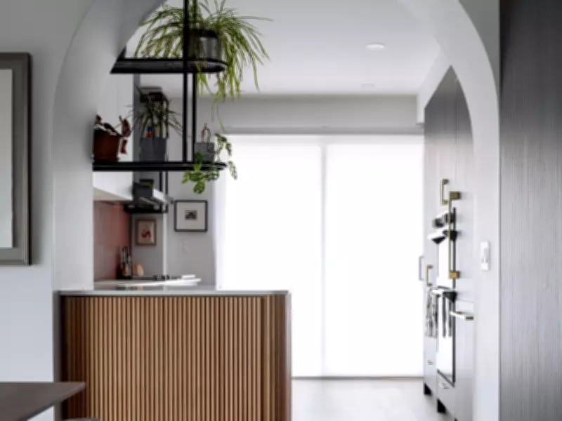
Kitchen: A Mondrian-Inspired Design
Marking the transition from the dining room to the kitchen with a broad arch, Martin says, was an obvious architectural choice; it’s a prominent focal point and, at a good three feet wide, makes a graceful entryway to the addition. An extended counter spans the dining room and kitchen; atop it, a deep cabinet faced in reeded white oak provides storage cabinetry on the dining room side and drawers on the kitchen side. The kitchen, Martin says, riffs on the owner’s love for art. The layout uses blocks of colour to highlight different planes: terracotta tiles on the back wall, plain pale-grey upper cabinets, dark wood-grained lower cabinets. Overhead, open black metal shelves with clean black lines offer a perch for plants, objects and cookbooks without blocking the light. Combined with the sleek black stainless-steel range hood and a horizontal window over the sink, it has a distinctly Mondrian-esque look about it.
Practical Solutions for Everyday Living
The owner, a professional with a little dog, is passionate about both art and books. Her wish list was mostly practical: improve storage, which was close to non-existent in the old house, brighten things up, and add style to her bedroom, which had a low ceiling and, due to a west-facing window, serious heat gain in summer. When the house was first constructed, it was even smaller, but a modest kitchen addition had since been built. However, it wasn’t in very good condition. In the end, Martin says, the decision was made to rebuild it in the same footprint, which solved problems on both the main and upper floors.
The result is a home that feels spacious and bright, with clever storage solutions and artistic touches throughout. The archway marks the entry to the kitchen, its width accommodating a good-sized serving counter and a cabinet with storage for both the kitchen and dining areas. Installing a front closet and extending its frame to the far wall created a window seat that offers extra storage.